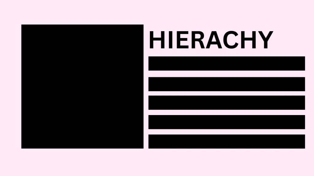
One of the most important aspects of any design is hierarchy. Hierarchy is the element that helps guide the reader’s or consumer’s eye through the design. It also helps the reader or consumer understand the design’s message. It can encompass the following attributes that can either make or break a design: size, proportion, color, contrast, and spacing.
Today, I gathered a few designs ranging from good hierarchy, bad hierarchy, and very bad hierarchy, so we can learn together and see the importance of the attributes of hierarchy as mentioned above, and the way it can impact a design and the information a reader has to process.
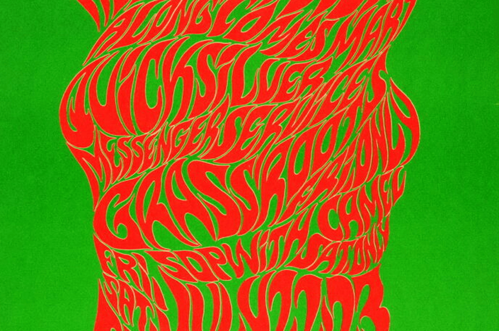
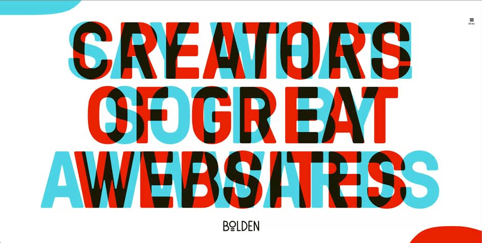
Starting off the very bad examples (no offense intended to the original creators! This is purely for educational purposes!)

In this design, all the words seem jumbled together, and the message’s concept is lost on the reader. One way to improve this design would be to increase the line spacing and reduce the subheadings’ font size to help the reader flow more easily through the design and better comprehend it.
In this design, the colors draw attention away from the text and the design’s literal message. To fix this design, one of the colors would need its saturation reduced or replaced with a more pastel or lighter shade to make the message easier to read.
Moving on to the bad examples of hierarchy…
This design has a lot going on both visually and literally. This design is overwhelming in both the colors and spacing. This design could benefit from adjusting the spacing and colors, and from allowing contrast between text colors.

This design can also be overwhelming to the reader. This design again has issues with spacing and the proportion of each line of text. This design could benefit from adjusting the font sizes, making the heading information the largest and the subtitles and subheadings smaller to make the information easier to grasp. I would also recommend sticking to a smaller color scheme, as the multiple colors can be confusing to the reader.
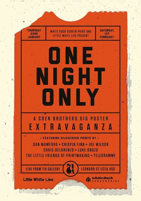
Now that we’ve discussed and examined the very bad and the bad examples of hierarchy, let’s look at some good examples.
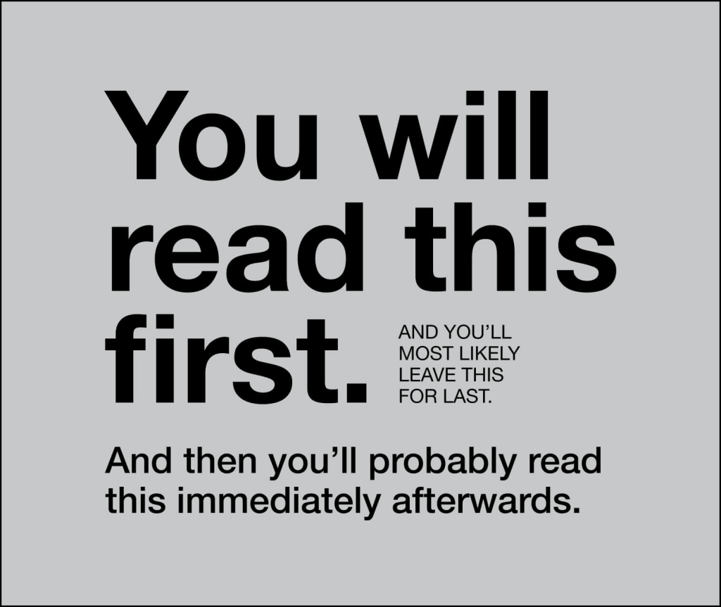
This design is an excellent example of hierarchy, as all the important aspects of hierarchy are in play. There is proper use of spacing, size, color, and proportion.
This design is also an excellent example of hierarchy, as the important information is displayed clearly and in a way that the reader can comprehend, while being visually appealing. There is proper use of size, proportion, and spacing.

Leave a comment