When discussing brands that utilize social media for their benefit, it is important to focus on one platform at a time and develop a campaign tailored to that platform, as each platform can serve a different purpose for the brand. If I were given a brand and had to develop its social media platforms from the ground up, the first platform I would focus on currently is TikTok. TikTok is one of the more popular platforms today. And it can lead to a high return on investment for brands if they use the platform effectively.
The first reason I would recommend that a brand utilize TikTok for its social media is the reach it provides through its algorithm. TikTok’s For You page feature enables broad reach among potential customers/followers of the brand. Another reason I would recommend TikTok first is its ability to target a specific demographic, as it typically has a younger audience.
I would also recommend TikTok because of its recent addition of the TikTok Shop, which allows users to shop directly on the app. This allows for more sales without leaving someone’s social media platform, whereas other platforms make users leave the app and may cause a loss of attention from their followers. Some users have even developed a QVC-like shopping show, displaying items on a carousel with special deals and offerings exclusive to TikTok users.
In the final reason, I recommend TikTok when all these other aspects are combined. It enables cost-effective advertising and broader reach for the brand. It is important to utilize all social media platforms, but when trying to grow and reach a desired audience, it is important to narrow down to what platforms are already popular with social media users
It’s no secret that social media has evolved over the last few decades, becoming an integral part of everyone’s daily lives. As we look ahead to the future of social media and begin to see new patterns in how platforms continually update and evolve their sites, I decided to list a few of my predictions for where I see social media going over the next 10 years.
Firstly, with developments like the Instagram Shop and TikTok Shop, I see social media becoming a new wave of sales shows like QVC, which were previously only available on mainstream media like radio or television. There will also be more control for content creators through this development, as they can just set up a live stream and sell or recommend products to followers or people just scrolling past on their timeline.
Another prediction, I feel, will be a few years in the future, but would still find interesting. If possible, it would be social media-exclusive shows from streaming platforms, as we see Netflix absorb podcasts and other forms of social media to their site. I think a reverse will happen, where Netflix and other streaming companies will begin to make content that’s only available on social media, especially given the extensions platforms are giving to their content time limits, like TikTok expanding to 10-minute videos.
With both of these predictions in mind, I can also see social media go the opposite way, as more and more people are using social media to discuss ways to get away from our phones and kind of get back to reality, and I could also see social media becoming more of a marketing space rather than a space of sharing personal content. However, I think the first predictions are more likely to come true as social media platforms continue to evolve, finding ways to keep users on the apps and connected.
Over the last seven weeks, I have chosen a local coffee shop and redesigned its visual identity to help elevate the brand and its purpose: to provide Long Island Natives with an ethical, educational, and high-quality coffee experience.
When starting this redesign process, I first wanted to visualize what Flux Coffee’s new visual identity would look like with a mood board.
The mood board covers the three most important questions a new customer may have when they encounter Flux Coffee: Who are we? What do we do? And who do we serve?
The answer to those three questions is: a local coffee shop focused on providing an ethical, educational, and high-quality coffee experience for Long Island Natives.
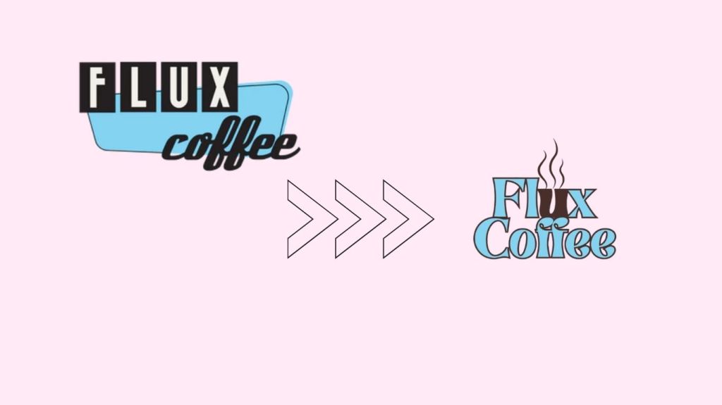
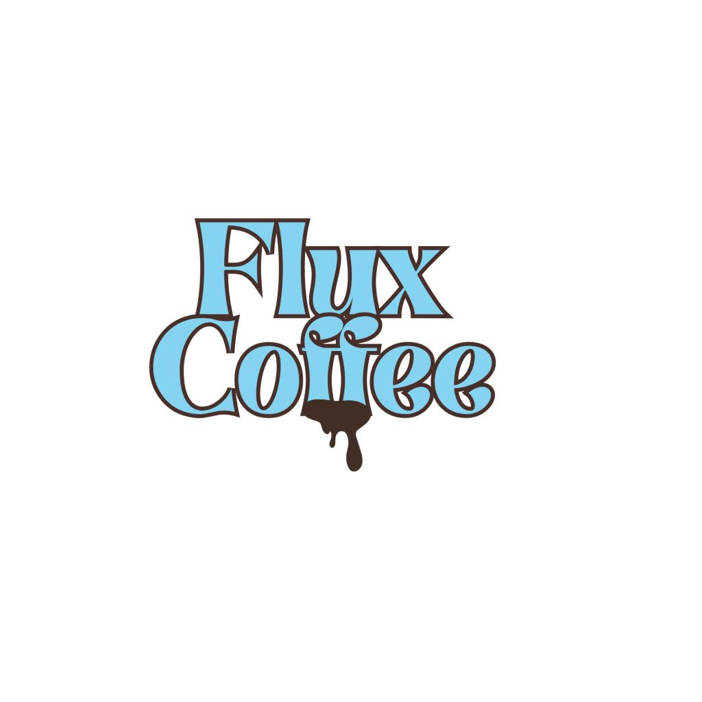
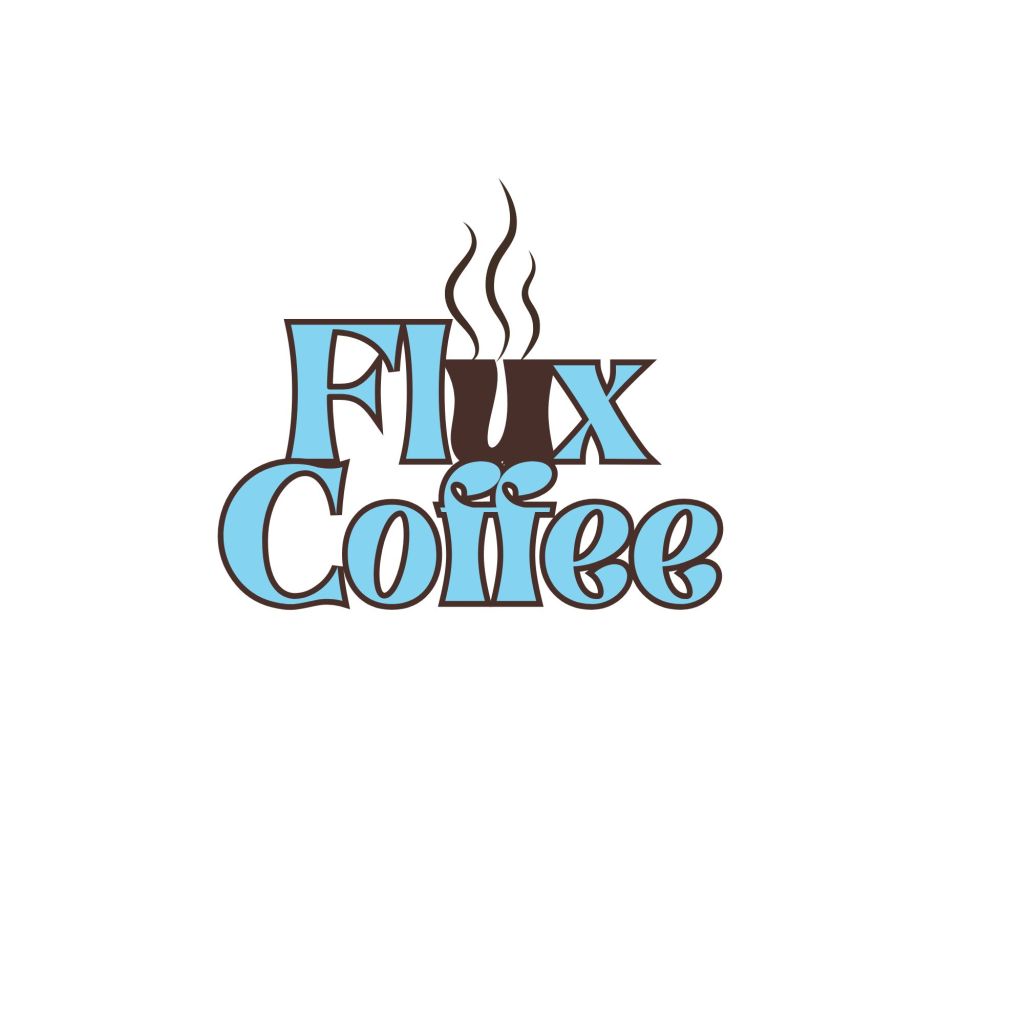
Then I redesigned Flux’s logo to create a memorable motif that would stand out among competitors. I chose to use the symbol of a steaming mug built into the brand’s name, as it will help our customers remember who we are and what we offer. I would then recommend using the secondary logo of just the steaming mug motif for any smaller business areas, like social media profile pictures, and on print items like menus and business cards.
I also further developed our brand’s color palette and typeface. I chose to stay within the original color palette and add a few shades of brown to symbolize the rich brown coffee we provide our customers. Then, for the typeface, I chose to develop and change our type to what I feel is the modern version of the original logo and typeface. I also still wanted to have a similar energy to the original typeface in the logo and find something that provides a similar 1950’s look and feel.
I then went on to design and develop the new brand identity system with products ranging from custom receipt paper to be used for every purchase in-store, labels for take-home coffee roasted on site, reward cards, menus, custom coffee cups, envelopes, thank you cards to be given for each coffee bag purchase, and brochures. I chose to develop the identity system around the newly expanded color palette to help create a clear brand in our customers’ minds.
After developing the new brand identity system, I went on to create a mock website for the brand. I also chose to use the richer browns in the new color palette to reinforce the connection to the ethical and educational coffee experience that Flux provides its customers on the website. For the site’s design, I tried to keep the original 1950’s look and modernize it slightly for today, keeping the design simple and clear.
Now that we have discussed Flux Coffee’s new visual brand, what about the new verbal brand and what we are trying to tell our customers?
Flux Coffee was established in 2010 on the West Coast and began brewing and bottling cold-brew coffee in kegs and bottles. After relocating to Long Island, Flux Coffee has since committed to providing a fully educational and ethical coffee experience.
So what is the problem with Flux Coffee then?
Flux Coffee can benefit from a redesign that showcases both its educational and fully customized coffee experience for customers while leveraging the aesthetic of its relocation to the East Coast, thus becoming a native Long Islander’s go-to coffee experience.
Which Flux Coffee customers will benefit from this redesign?
Flux Coffee prioritizes our customers’ needs and wants. Our customer profile is made of the following traits that, when combined, create the perfect brew of a Flux Coffee Customer:
Coffee Lovers
Those who prioritize ethical practices and the consumption of Coffee
Long Island Natives
Those who are willing/ or want to have a full Immersive and customized coffee buying experience
How can we stand out? What do Flux Coffee’s current competitors look like?
Other local coffee shops
The Coffee Grind ( a new business that provides a wide range of coffee from across multiple cultures)
Perk (cafe design inspired by Friends (a nod to New Yorkers as a whole rather than just Long Island Natives)and has a cozy atmosphere with quick service)
The Barn (Providing a quick, yet customized coffee drive-thru experience, which also went viral on TikTok recently)
At-Home coffee options
We have to make it clear to our customers why Flux Coffee is the superior choice for the coffee lover’s experience.
We provide the entire coffee-buying experience, from ethical manufacturing to customer education, while delivering high-quality products and quick service.
This leads us to the new, redesigned brand message that will be carried through all visual and verbal design.
Flux Coffee prioritizes a fully customized, educational coffee experience tailored to Long Island Natives.
Our slogan will make our brand message memorable to our customers
“A Coffee Experience Curated for Long Island”
I hope that through both the visual and verbal redesign, our company values will be accurately reflected.
Ethical harvesting and roasting of coffee
Creating fresh, high-quality, and customized coffee beverages for every customer
Educating customers on our entire coffee brewing experience and persona
Our staff will be welcoming, educational, and chatty with our customers to create an inclusive community for all of Long Island.
Flux Coffee will utilize words and phrases that emphasize our appreciation for our Long Island native customers who love coffee the way we do!
Check out the entire deck below for the new era of Flux Coffee!
There is no doubt when it comes to visual design, logos can make or break a company. But as time has evolved, so have some of the most iconic companies and their logos. This allows brands to evolve with time and their customers while staying memorable through their visual design. Today, I chose to examine two of my most memorable logos for two iconic companies and compare how they have evolved through time.
The first company I chose to examine is YouTube. YouTube was first created in 2005. YouTube is one of the most iconic video-sharing platforms, with over 2.7 billion users reported monthly. But how has their logo changed over time?
2005:
This was YouTube’s first logo. The design is simple enough for users to comprehend the company name, but not yet the platform’s purpose.
2011:
The logo was updated to a darker red and given a matte finish. Again, the design is simple and comprehensible but lacks an overall sense of the platform’s purpose.
Which brings us up to current times…
2017:
This has been the YouTube logo since 2017. This logo still retains the simple aesthetics and colors of the two previous logos, but now includes the added play button. This allows the user not only to comprehend the platform’s purpose but also to give it a memorable motif.
Next, we will look at the evolution of Amazon’s logo.
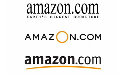
Amazon started as an online bookstore in 1994 and has since become a mega store, partnering with vendors such as Whole Foods and Grubhub. But how has their logo evolved with the company over the years?
1995:
This is the original Amazon logo. It was inspired by the brand’s name. The logo was simple enough, but at the time, it didn’t truly reflect the brand’s purpose, which at the time was online book shopping, much like YouTube’s.
1998:
The company went through many logo changes in 1998, but ultimately stuck with this design until recent years. This logo is simple but lacks a reason to be memorable and a clear sense of the company’s purpose.
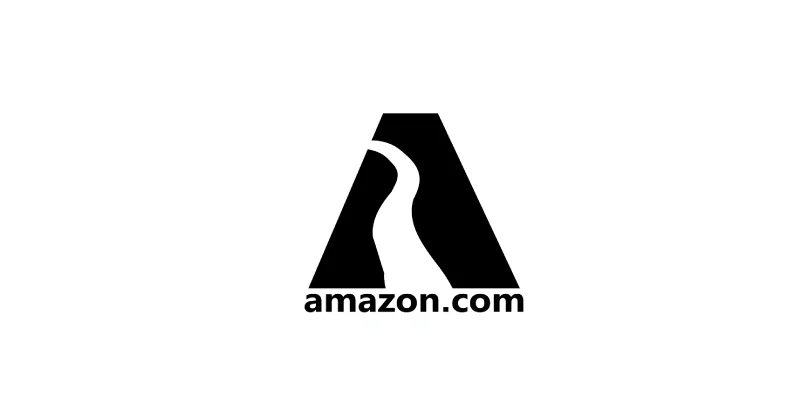
2000:
This is the current Amazon logo. This logo is an iteration of the 1998 logo, offering greater clarity and making the brand more memorable. The yellow smile line signifies the commitment to providing customers with a satisfactory online shopping experience. The smile line also starts at the A in the name and ends at the Z, indicating that any items are available from “A to Z”.
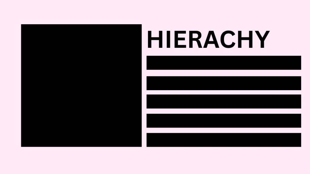
One of the most important aspects of any design is hierarchy. Hierarchy is the element that helps guide the reader’s or consumer’s eye through the design. It also helps the reader or consumer understand the design’s message. It can encompass the following attributes that can either make or break a design: size, proportion, color, contrast, and spacing.
Today, I gathered a few designs ranging from good hierarchy, bad hierarchy, and very bad hierarchy, so we can learn together and see the importance of the attributes of hierarchy as mentioned above, and the way it can impact a design and the information a reader has to process.
Starting off the very bad examples (no offense intended to the original creators! This is purely for educational purposes!)
In this design, all the words seem jumbled together, and the message’s concept is lost on the reader. One way to improve this design would be to increase the line spacing and reduce the subheadings’ font size to help the reader flow more easily through the design and better comprehend it.
In this design, the colors draw attention away from the text and the design’s literal message. To fix this design, one of the colors would need its saturation reduced or replaced with a more pastel or lighter shade to make the message easier to read.
Moving on to the bad examples of hierarchy…
This design has a lot going on both visually and literally. This design is overwhelming in both the colors and spacing. This design could benefit from adjusting the spacing and colors, and from allowing contrast between text colors.
This design can also be overwhelming to the reader. This design again has issues with spacing and the proportion of each line of text. This design could benefit from adjusting the font sizes, making the heading information the largest and the subtitles and subheadings smaller to make the information easier to grasp. I would also recommend sticking to a smaller color scheme, as the multiple colors can be confusing to the reader.
Now that we’ve discussed and examined the very bad and the bad examples of hierarchy, let’s look at some good examples.
This design is an excellent example of hierarchy, as all the important aspects of hierarchy are in play. There is proper use of spacing, size, color, and proportion.
This design is also an excellent example of hierarchy, as the important information is displayed clearly and in a way that the reader can comprehend, while being visually appealing. There is proper use of size, proportion, and spacing.
When discussing visual design, we would be remiss not to address the importance of color. Color alone can stir up emotions in its viewer. Color and design should also be studied in terms of how they can impact a culture and the people within it. For the purposes of this discussion, we will examine how various cultures around the world view and use the color red. I chose red because it is one of the primary colors that serve as the building blocks for mixing all other secondary colors.
Red was first viewed as an important color/symbol by the ancient Chinese, dating to around 2070 BC – 1600 BC, and was seen as a symbol of power. Weapons were painted red during times of battle to symbolize strength.
Then, in Egypt, people believed a yellow-orange shade of red represented life and vitality. The Egyptians also used red in their hieroglyphics to depict fire.
The color red is also widely accepted across many cultures as the color of love. Brides in India often wear the color red to symbolize love and purity.
In Britain, the jewel rubies are widely considered the stone of true love, energy, and success. Prince William proposed to Princess Kate Middleton with a diamond ring set with antique rubies because of the country’s connection to the jewel’s color.
In Japan, red is often associated with a man’s primal urges and is considered a sensual color.
The color can also represent blood, fire, and the sun in this country.
In parts of Africa, the color red is considered holy. Red is also known as the color of mourning. In certain regions of Africa, women are prohibited from wearing the color red.
In Greek culture, when people say things at the same time, there is a belief that they will eventually get into an argument, and they must touch the closest red item to cancel out the potential fight.
In Jamaica, the word red itself can be used to define someone who is drunk or under the influence of substances.
In Russia, the color red can carry two meanings: some may view it as a connection to beauty because the Russian words for beauty and for the color share the same root. Others associate red with communism, linking it to the Soviet Union.
Through various cultures, red carries significance and impact for its people. That is why, when it comes to visual design, it’s important to consider the colors and even the cultural implications some colors may have for potential consumers or viewers.
davidstone1313. “A Brief History of the Color Red and Its Meaning – Roosevelt…” Roosevelt Island, New York, Daily News, 12 Dec. 2022, rooseveltislanddaily.news/2022/02/18/the-color-red-a-brief-history/
When tasked with choosing a small to medium-sized business that needed a visual redesign, I thought of a local coffee shop that I often frequent. Flux Coffee was established in 2010 on the West Coast and began brewing and bottling cold-brew coffee in kegs and bottles. After relocating to the East Coast, specifically Farmingdale, New York. Flux Coffee has since committed to providing a fully educational, customized, ethical coffee experience for its customers.
I defined the problem that necessitated a visual redesign to enable Flux Coffee to showcase both its educational and fully customized coffee experience for customers, while leveraging the aesthetic of its relocation to Long Island, New York, thereby becoming a native Long Islander’s go-to coffee experience.
Then I began researching how Flux Coffee currently treats its audience to define the needed changes. Flux Coffee needs to continue prioritizing our customers’ needs and wants. Our customer profile is made of the following traits that, when combined, create the perfect brew of a Flux Coffee Customer:
Coffee Lovers
Those who prioritize ethical consumption and coffee harvesting practices
Long Island Natives
Those who are willing/ or want to have a full Immersive and customized coffee buying experience
After establishing a basis for our audience or customers, I began researching our competitors. Flux Coffee’s competitors can range from the following, and it’s Imperative that we utilize this redesign to become stand-outs in the market:
Fast Coffee Chains (Starbucks, Dunkin’ Donuts)
At-Home Coffee Brands (Nespresso, Keurig)
After establishing the audience and competitors, I combined these insights to develop a new slogan for Flux Coffee. I created the following comprehensive slogan for the brand. Flux Coffee prioritizes a fully customized, educational coffee experience tailored for Long Island Natives. Our Slogan should reflect that experience:
“A Coffee Experience Curated for Long Island”
Then I consider how the name fits into the new brand identity for Flux. I decided that Flux Coffee still works as the name for our redesign. However, with the new branding and logo redesign, our values and who we are as a company will be clearer to our customers.
Then I began to develop and further clarify the brand’s values. Flux Coffee prioritizes the following aspects:
Ethical harvesting and roasting of coffee
Creating fresh, high-quality, and customized coffee beverages for every customer
Educating customers about our entire coffee-brewing experience and persona.
Following the values, I began to develop and consider the language and how it would align with the company’s mission. As already established, Flux Coffee prioritizes a fully customized, educational coffee experience tailored for Long Island Natives. Our staff will be welcoming, educational, and chatty with our customers to create an inclusive community, and this language will be carried over into all marketing materials and the shop’s physical environment. Flux Coffee will utilize words and phrases that emphasize our appreciation for our Long Island native customers who love coffee the way we do through our tone of voice.
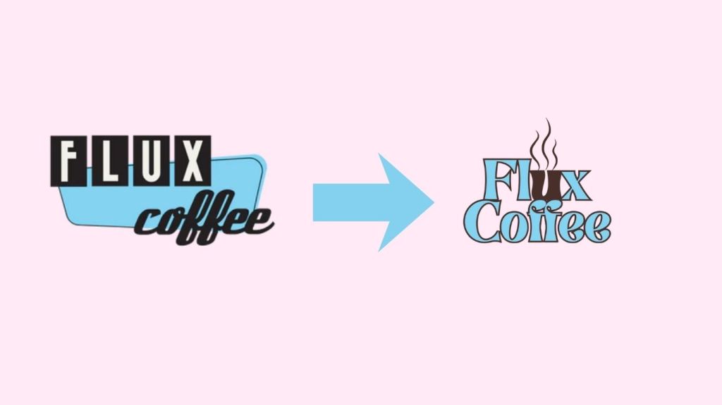
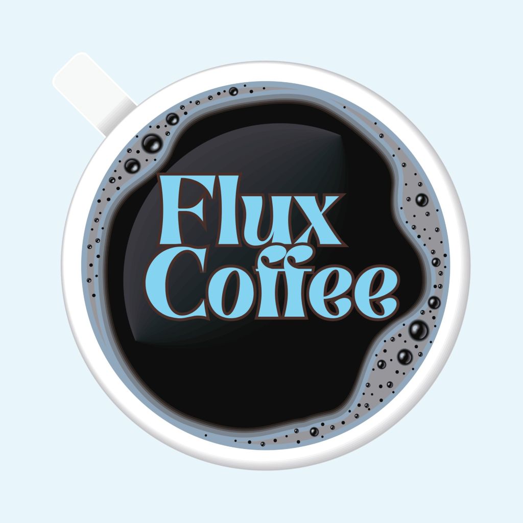
I then developed some basic ideas for a new logo for Flux Coffee, as seen below. I wanted to keep the original iconic light blue while also emphasizing the rich coffee brown.
When discussing privacy, data protection, and ethical practices for collecting user information on social media, TikTok often becomes an immediate topic. TikTok began to gain real growth in users during the pandemic in 2020. TikTok gained its popularity through its algorithm and its extremely personalized FYP or “For You Page.” But how does TikTok gather the data to create a “For You Page”?
Account information such as name, email, password, date of birth, profile image, and phone number
Any user content that is imported or exported from the platform ( images, videos, comments, livestreams, or texts)
Messages
AI Content (Both outside the platform and through the platform’s AI feature)
Phone and social networks (with users’ permission)
Purchase information (utilizied throughthe use of the TikTok shop)
The site continues to state that the platform follows the rules and regulations set by the CCPA or the California Consumer Privacy Act. This act allows for the right to know, correct, delete, or even opt out of the sharing of personal information to companies like TikTok. The app then goes on to state that it also automatically tracks certain data when using its services, regardless of permissions granted or not. These data points include cookies, usage information for the relationship between the user and its platform, and IP address information, along with location information.
The platform’s tracking of location information has recently come under fire since the purchase of TikTok was split by three of the largest US investors in the company following the short-lived ban of the platform. One complaint from the users who read the new terms and conditions for usage when the app was brought back onto the US market following the sale was the “invasive” precise location tracking. The concern stems from this high-level tracking not being included in the original terms and conditions before the ban.
When using a social media platform its important that both the platform and the user understand what data points are being track adn how it is being used. In terms of recommendations, while I understand the allure and the marketing purposes of TikTok being extremely personalized, I think this also leads to alienation for a large section of users who don’t want to be constantly tracked, especially to such extremes as tracking precise locations. I would recommend that the app take these users’ complaints into serious consideration, as the app was functional and widely used before this change. Changing their location policy back to the way it was before the purchase might actually help the platform and show that they care and are actively listening to their users.
Sources:
“California Consumer Privacy Act (CCPA).” State of California – Department of Justice – Office of the Attorney General, 28 Jan. 2025, oag.ca.gov/privacy/ccpa.
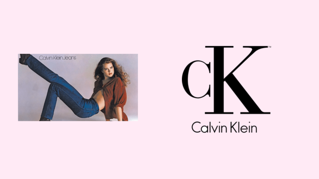
In recent weeks, there has been a new fashion trend circulating on social media platforms since the release of Hulu’s series Love Story, based on the real-life story of JFK Jr. and Carolyn Bessette. Influencers have taken to their platforms with posts that are outfits, makeup tutorials, and hairstyles (even as far as dying their hair after watching the series), inspired by Carolyn and her iconic looks. One of the most common brands mentioned when discussing Carolyn’s fashion was Calvin Klein, the brand that employed her and launched her romance with JFK Jr. Calvin Klein has been known for its classic fashion as well as its iconic collaborations with its models, ranging from Brooke Shields to, as of recent, Bad Bunny. But what if Calvin Klein started utilizing the changing landscape of advertising and launched an influencer marketing campaign?
Calvin Klein has iconic ads for their company of portraits of their models dressed in their clothes, ranging from their denim to their underwear. I believe if Calvin Klein begins to utilize the influencer space properly, they can see a real impact and ROI for their brand. I would set the objectives of the campaigns as the following: Utilize the current discussion on Carolyn Bessette’s iconic looks and raise brand awareness through influencers who have a similar fashion sense to her, and have a major increase in conversion through shopable ads, specifically through Instagram, to mimic the iconic billboard and in-store visuals. This can also be achieved through a series of sponsored posts from the influencers and utilizing affiliate marketing of a specific discount that is exclusive to the influencer’s code on the site. In regard to the content, the influencers would post, I think it would be best to mimic the iconic ads, a simple portrait with the iconic Calvin Klein pieces. Some of the pieces can be remakes of Carolyn’s most iconic looks, like the camel skirt and the simple black top, or the classic Calvin Klein denim. The influencers can also post a series of stories with affiliate links, showing how Calvin Klein fits seamlessly into their daily routine, much like it did for Carolyn.
The influencers I would recommend for this campaign are Emma Pritchard and Greta Tomé. Emma Pritchard is from Massachusetts (a nod to the Kennedys’ iconic home state) and has a total of 383K followers on Instagram and has a similar fashion sense to Carolyn, of simple yet classic outfits. Greta Tomé is from NYC and shows her life living on the Upper East Side, as well as her classic style ( a nod to the main setting of the series and the couple’s real-life home). Greta has a total of 308K followers on Instagram.
Throughout the campaign, we will utilize the collaboration feature on Instagram and use Instagram insights to track the amount of engagement and click-throughs to the site, as well as purchases directly through Instagram’s shop feature. We will also track the number of times the specialized coupon code is used to track the number of customers who are coming directly from the influencers’ page. The only real challenge I can foresee for this campaign is that the allure of Calvin Klein’s ads may be lost on the younger users on the app. But this can be fixed by Calvin Klein posting a series of throwback posts to show the influences their ads and fashion have had on society over the years.
When developing an audience target strategy, I chose to analyze and use the brand Kitsch. Kitsch is a female-founded and owned hair and body care brand. Kitsch is sold both in stores and has a strong online presence through apps like TikTok. If I were developing a strategy to develop and properly target a specific audience, I would first look at the products sold by the brand, as that will give more insight into how to properly target the people who will understand and value the brand and what it sells.
Kitsch sells a range of haircare, body care, and beauty tools. It was built out of the owner’s and founders’ need for elevated, sustainable beauty products. I would first focus on the demographics of our target audience for ads, which is mainly women on the platform. Kitsch makes a point to emphasize the relevance of being female-owned and founded through their site and social media posts. So ideally, the gender and age would be women from 18 to 65. I would also set the range of reach of these ads to worldwide, as the brand emphasizes their products’ sustainability features for the benefits of creating a healthy earth and minimizing beauty product waste through products like shampoo bars and solid face washes.
Then, further breaking down the ideal demographic, I would target those women who have an interest in beauty products and tools and have frequent interactions with beauty brands and beauty advertisements. When developing the target audience, we can also utilize those who are following a large number of beauty influencers and have made past purchases on beauty brand sites, who may be our competitors through social media ads. I would target those who have the room in their budget to purchase beauty products outside of the typical drugstore range, as I wouldn’t classify Kitsch as luxury, but it also sits outside the drugstore range
For the lookalike audience, I would recommend narrowing in on the women from the ages of 18-40 who prirotize self care and using sustainable products, as well as following the trend in the beauty industry of prioritizing purchasing clean beauty products, which Kitsch does offer through their products. I would also recommend narrowing our target audience to the women who prioritize using aesthetically pleasing beauty products. Kitsch offers a range of products that are both functional and look luxe and high quality for a middle-of-the-pack price point.
Through these two target audiences, I believe Kitsch could see a return on their investments in social media advertisements through not only conversions but also finding customers that align with the brand’s value and mission through its products.