Category: visual design

  • Flux Coffee: Redesign and Rationale

    Over the last seven weeks, I have chosen a local coffee shop and redesigned its visual identity to help elevate the brand and its purpose: to provide Long Island Natives with an ethical, educational, and high-quality coffee experience.

    When starting this redesign process, I first wanted to visualize what Flux Coffee’s new visual identity would look like with a mood board.

    The mood board covers the three most important questions a new customer may have when they encounter Flux Coffee: Who are we? What do we do? And who do we serve?

    The answer to those three questions is: a local coffee shop focused on providing an ethical, educational, and high-quality coffee experience for Long Island Natives.

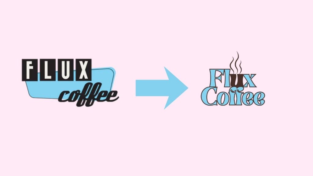
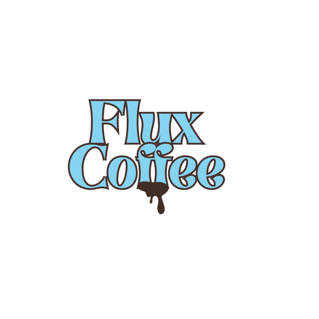
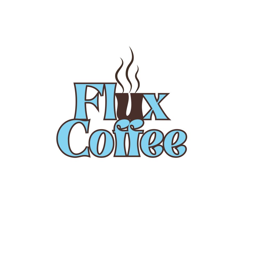
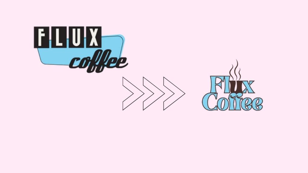
    Then I redesigned Flux’s logo to create a memorable motif that would stand out among competitors. I chose to use the symbol of a steaming mug built into the brand’s name, as it will help our customers remember who we are and what we offer. I would then recommend using the secondary logo of just the steaming mug motif for any smaller business areas, like social media profile pictures, and on print items like menus and business cards.

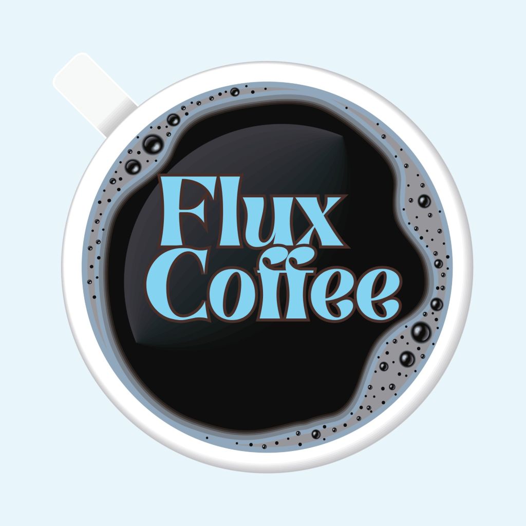
    I also further developed our brand’s color palette and typeface. I chose to stay within the original color palette and add a few shades of brown to symbolize the rich brown coffee we provide our customers. Then, for the typeface, I chose to develop and change our type to what I feel is the modern version of the original logo and typeface. I also still wanted to have a similar energy to the original typeface in the logo and find something that provides a similar 1950’s look and feel.

    I then went on to design and develop the new brand identity system with products ranging from custom receipt paper to be used for every purchase in-store, labels for take-home coffee roasted on site, reward cards, menus, custom coffee cups, envelopes, thank you cards to be given for each coffee bag purchase, and brochures. I chose to develop the identity system around the newly expanded color palette to help create a clear brand in our customers’ minds.

    After developing the new brand identity system, I went on to create a mock website for the brand. I also chose to use the richer browns in the new color palette to reinforce the connection to the ethical and educational coffee experience that Flux provides its customers on the website. For the site’s design, I tried to keep the original 1950’s look and modernize it slightly for today, keeping the design simple and clear.

    Now that we have discussed Flux Coffee’s new visual brand, what about the new verbal brand and what we are trying to tell our customers?

    Flux Coffee was established in 2010 on the West Coast and began brewing and bottling cold-brew coffee in kegs and bottles. After relocating to Long Island, Flux Coffee has since committed to providing a fully educational and ethical coffee experience.

    So what is the problem with Flux Coffee then?

    Flux Coffee can benefit from a redesign that showcases both its educational and fully customized coffee experience for customers while leveraging the aesthetic of its relocation to the East Coast, thus becoming a native Long Islander’s go-to coffee experience.

    Which Flux Coffee customers will benefit from this redesign?

    Flux Coffee prioritizes our customers’ needs and wants. Our customer profile is made of the following traits that, when combined, create the perfect brew of a Flux Coffee Customer:

    • Coffee Lovers
    • Those who prioritize ethical practices and the consumption of Coffee
    • Long Island Natives
    • Those who are willing/ or want to have a full Immersive and customized coffee buying experience

    How can we stand out? What do Flux Coffee’s current competitors look like?

    • Other local coffee shops
      • The Coffee Grind ( a new business that provides a wide range of coffee from across multiple cultures)
      • Perk (cafe design inspired by Friends (a nod to New Yorkers as a whole rather than just Long Island Natives)and has a cozy atmosphere with quick service)
      • The Barn (Providing a quick, yet customized coffee drive-thru experience, which also went viral on TikTok recently)
    • At-Home coffee options

    We have to make it clear to our customers why Flux Coffee is the superior choice for the coffee lover’s experience.

    We provide the entire coffee-buying experience, from ethical manufacturing to customer education, while delivering high-quality products and quick service.

    This leads us to the new, redesigned brand message that will be carried through all visual and verbal design.

    Flux Coffee prioritizes a fully customized, educational coffee experience tailored to Long Island Natives.

    Our slogan will make our brand message memorable to our customers

    “A Coffee Experience Curated for Long Island”

    I hope that through both the visual and verbal redesign, our company values will be accurately reflected.

    • Ethical harvesting and roasting of coffee
    • Creating fresh, high-quality, and customized coffee beverages for every customer
    • Educating customers on our entire coffee brewing experience and persona

    Our staff will be welcoming, educational, and chatty with our customers to create an inclusive community for all of Long Island.

    Flux Coffee will utilize words and phrases that emphasize our appreciation for our Long Island native customers who love coffee the way we do!

    Check out the entire deck below for the new era of Flux Coffee!

  • Comparing Hierachy in Design: The Good v.s. The Bad v.s. The Very Bad

    One of the most important aspects of any design is hierarchy. Hierarchy is the element that helps guide the reader’s or consumer’s eye through the design. It also helps the reader or consumer understand the design’s message. It can encompass the following attributes that can either make or break a design: size, proportion, color, contrast, and spacing.

    Today, I gathered a few designs ranging from good hierarchy, bad hierarchy, and very bad hierarchy, so we can learn together and see the importance of the attributes of hierarchy as mentioned above, and the way it can impact a design and the information a reader has to process.

    Starting off the very bad examples (no offense intended to the original creators! This is purely for educational purposes!)

    In this design, all the words seem jumbled together, and the message’s concept is lost on the reader. One way to improve this design would be to increase the line spacing and reduce the subheadings’ font size to help the reader flow more easily through the design and better comprehend it. 

    In this design, the colors draw attention away from the text and the design’s literal message. To fix this design, one of the colors would need its saturation reduced or replaced with a more pastel or lighter shade to make the message easier to read.

    Moving on to the bad examples of hierarchy…

    This design has a lot going on both visually and literally. This design is overwhelming in both the colors and spacing. This design could benefit from adjusting the spacing and colors, and from allowing contrast between text colors.

    This design can also be overwhelming to the reader. This design again has issues with spacing and the proportion of each line of text. This design could benefit from adjusting the font sizes, making the heading information the largest and the subtitles and subheadings smaller to make the information easier to grasp. I would also recommend sticking to a smaller color scheme, as the multiple colors can be confusing to the reader.

    Now that we’ve discussed and examined the very bad and the bad examples of hierarchy, let’s look at some good examples.

    This design is an excellent example of hierarchy, as all the important aspects of hierarchy are in play. There is proper use of spacing, size, color, and proportion.

    This design is also an excellent example of hierarchy, as the important information is displayed clearly and in a way that the reader can comprehend, while being visually appealing. There is proper use of size, proportion, and spacing.

  • The Cultural Impact and Significance of The Color Red

    When discussing visual design, we would be remiss not to address the importance of color. Color alone can stir up emotions in its viewer. Color and design should also be studied in terms of how they can impact a culture and the people within it. For the purposes of this discussion, we will examine how various cultures around the world view and use the color red. I chose red because it is one of the primary colors that serve as the building blocks for mixing all other secondary colors.

    Red was first viewed as an important color/symbol by the ancient Chinese, dating to around 2070 BC – 1600 BC, and was seen as a symbol of power. Weapons were painted red during times of battle to symbolize strength. 

    Then, in Egypt, people believed a yellow-orange shade of red represented life and vitality. The Egyptians also used red in their hieroglyphics to depict fire.

    The color red is also widely accepted across many cultures as the color of love. Brides in India often wear the color red to symbolize love and purity. 

    In Britain, the jewel rubies are widely considered the stone of true love, energy, and success. Prince William proposed to Princess Kate Middleton with a diamond ring set with antique rubies because of the country’s connection to the jewel’s color.

    In Japan, red is often associated with a man’s primal urges and is considered a sensual color.

    The color can also represent blood, fire, and the sun in this country. 

    In parts of Africa, the color red is considered holy. Red is also known as the color of mourning. In certain regions of Africa, women are prohibited from wearing the color red.

    In Greek culture, when people say things at the same time, there is a belief that they will eventually get into an argument, and they must touch the closest red item to cancel out the potential fight.

    In Jamaica, the word red itself can be used to define someone who is drunk or under the influence of substances. 

    In Russia, the color red can carry two meanings: some may view it as a connection to beauty because the Russian words for beauty and for the color share the same root. Others associate red with communism, linking it to the Soviet Union.

    Through various cultures, red carries significance and impact for its people. That is why, when it comes to visual design, it’s important to consider the colors and even the cultural implications some colors may have for potential consumers or viewers.

    Sources:

    “Color across Cultures: Reading Red – Sherwin-Williams.” Sherwin, http://www.sherwin-williams.com/architects-specifiers-designers/education/project-profiles/sw-article-pro-coloracrosscult. Accessed 4 Apr. 2026

    davidstone1313. “A Brief History of the Color Red and Its Meaning – Roosevelt…” Roosevelt Island, New York, Daily News, 12 Dec. 2022, rooseveltislanddaily.news/2022/02/18/the-color-red-a-brief-history/

    When Does Russia See Red? Foreign Minister Lavrov on Red Lines | Russia Matters, http://www.russiamatters.org/blog/when-does-russia-see-red-foreign-minister-lavrov-red-lines. Accessed 5 Apr. 2026

  • Redesigning Flux Coffee: Brand Identity/Strategy

    When tasked with choosing a small to medium-sized business that needed a visual redesign, I thought of a local coffee shop that I often frequent. Flux Coffee was established in 2010 on the West Coast and began brewing and bottling cold-brew coffee in kegs and bottles. After relocating to the East Coast, specifically Farmingdale, New York. Flux Coffee has since committed to providing a fully educational, customized, ethical coffee experience for its customers.

    I defined the problem that necessitated a visual redesign to enable Flux Coffee to showcase both its educational and fully customized coffee experience for customers, while leveraging the aesthetic of its relocation to Long Island, New York, thereby becoming a native Long Islander’s go-to coffee experience.

    Then I began researching how Flux Coffee currently treats its audience to define the needed changes. Flux Coffee needs to continue prioritizing our customers’ needs and wants. Our customer profile is made of the following traits that, when combined, create the perfect brew of a Flux Coffee Customer:

    • Coffee Lovers
    • Those who prioritize ethical consumption and coffee harvesting practices 
    • Long Island Natives
    • Those who are willing/ or want to have a full Immersive and customized coffee buying experience

    After establishing a basis for our audience or customers, I began researching our competitors. Flux Coffee’s competitors can range from the following, and it’s Imperative that we utilize this redesign to become stand-outs in the market:

    • Fast Coffee Chains (Starbucks, Dunkin’ Donuts)
    • At-Home Coffee Brands (Nespresso, Keurig)

     After establishing the audience and competitors, I combined these insights to develop a new slogan for Flux Coffee. I created the following comprehensive slogan for the brand. Flux Coffee prioritizes a fully customized, educational coffee experience tailored for Long Island Natives. Our Slogan should reflect that experience: 

    “A Coffee Experience Curated for Long Island” 

    Then I consider how the name fits into the new brand identity for Flux. I decided that Flux Coffee still works as the name for our redesign. However, with the new branding and logo redesign, our values and who we are as a company will be clearer to our customers.

    Then I began to develop and further clarify the brand’s values. Flux Coffee prioritizes the following aspects:

    • Ethical harvesting and roasting of coffee
    • Creating fresh, high-quality, and customized coffee beverages for every customer
    • Educating customers about our entire coffee-brewing experience and persona.

    Following the values, I began to develop and consider the language and how it would align with the company’s mission. As already established, Flux Coffee prioritizes a fully customized, educational coffee experience tailored for Long Island Natives. Our staff will be welcoming, educational, and chatty with our customers to create an inclusive community, and this language will be carried over into all marketing materials and the shop’s physical environment. Flux Coffee will utilize words and phrases that emphasize our appreciation for our Long Island native customers who love coffee the way we do through our tone of voice. 

    I then developed some basic ideas for a new logo for Flux Coffee, as seen below. I wanted to keep the original iconic light blue while also emphasizing the rich coffee brown.