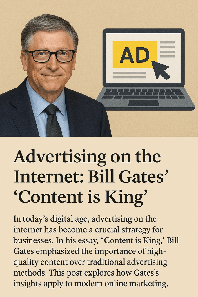
Author: KOMA designs

  • Gathering App Point of Views: a Comparison of Pinterest, LTK, and Sephora

    After spending some time developing and researching Problem Statements, the next step is to move on to the App Point of views, which allows us as designers to see real opinions, thoughts, and experiences. 

    I choose to analyze the three following apps: Pinterest, LTK, and Sephora. I wanted to choose apps that had similar features but varied in their ability for in-app interactions. Pinterest is the app that allows for the most interactions while being able to buy items from the app. LTK is similar to Pinterest; however, it is widely used by influencers as a way to share their affiliate links for their followers to shop from as well as explore other items to buy. Sephora then only allows exploration of their stock from a range of select higher-end brands, which tie into their marketing of being a luxury beauty store. 

    Pinterest had a range of positive, negative, and suggestive reviews. The positive reviews focused on the wide range of images/products you can find on the app. The negative reviews however, frequently complained about the overwhelming amount of ads on the app that merge with normal posts. I, as a user of pinterest, can agree with the negative reviews. I personally found it a struggle as the post tiles and advertisement tiles look exactly and that when you click on an ad without realizing it takes you directly out of the app to a web browser and oftentimes you lose your place in the app. The suggestive reviews often mentioned fixing the app’s crashes and random banning of accounts. 

    LTK (LikeToKnow) also had positive, negative, and suggestive reviews. LTK’s positive reviews ranged from customers loving being able to shop easier and quicker online with direct links to products they wanted as well as feeling included by their favorite influencers through sharing their beloved products. LTK’s negative reviews mainly focused on the design of the app itself with some stating the app, after a recent update, looked bulky and confusing to navigate. LTK suggestive reviews consisted of not wanting the app to open links in other browsers and be able to buy directly on the app. 

    I then took a look at Sephora’s positive, negative and suggestive reviews. Sephora’s positive reviews consisted of beauty consumers loving the range of products the site had to offer as well as customer service experience they had on the app. The negative reviews then consisted of an age limit for using the app and purchasing online, that being 13 and up. The suggestive reviews again consisted of fixing bugs and app crashes. 

    I then developed user POV statements for each app. This allowed me to get clear on the reasons behind customers using the app as well as the takeaways they get from using the app ranging from new products or new ideas. See below fro the full scope of reviews and User POV statements I created fro the three apps.

  • Creating Personas

    As UX designers, one of the most important things we can do to design a successful product is to thoroughly understand and develop a well-rounded understanding of our target customers. Personas are all about building empathy amongst your team. Great software gets made when the people who make it care about the people who use it. Personas provide a comprehensive view of the potential customers of your product. It blends the who, the what, and the why together of the person who uses the product. 

    When looking at the previous blog post comparing the usability of Target and Amazon, in the case of Target specifically, we can identify multiple personas for the potential shopper at Target. In this case, however, I will develop a persona for myself and a hypothetical woman, through my own experience shopping at the stores and knowing their target audience. 

    The first persona I developed was for the hypothetical user of Target, Jane Doe. Jane is a 33-year-old Guidance Counselor who makes $95,000. She has been married for Five Years and has two kids (4 4-year-old girl and 2 2-year-old boy). Jane was (hypothetically) quoted as saying, “I need a place to do all my shopping at once. From baby food and diapers to groceries”. Jane wants a place where she has all her needs met on an after-work trip before she picks up the kids from daycare. She also prioritizes the option for order pickup for when she has to stay late for work events, and her husband, John, has to do the shopping for the week.  Target provides the opportunity to hit all areas she needs and makes the week less stressful for her and her family. This allows her to focus on her job better and be able to help her students through academic and personal Issues. Target also provides her with high motivation with relatively easy accessibility. Her influences can range from her kids, her husband, and her students. 

    Following Jane’s Persona, I developed a persona for myself and my reasons for using Target. I am 24 and work a 9-5, Monday to Friday, as a Higher Education Admin who also goes to school full-time. I still live with my parents at home, and my Weekends are the majority of free time. My thoughts about using Target are as follows: “I go to Target to know all my needs, from groceries to self-care and school supplies/ technology will be met”. I want to be able to maximize my free time on weekends to spend it doing hobbies I enjoy, seeing friends and family, and relaxing before another busy week, balancing school and work begin. Target allows me to place orders to quickly pick up what I need for the week and be on my way. Target also allows me to pick up on nights after work from 5 pm on.  Target also provides me with high motivation with relatively easy accessibility. My influences can range from my job, my school schedule, and it’s easier to pick up and order, and not have to rush through a store or wait in line, and lose time I’d rather spend doing something that fulfills me. 

    Developing personas will allow for the successful design of your product, as you will be able to build it around your target audience to ensure their needs are being met through your product. 

    See below for the full personas!

    Sources:

    Ralph, Ben Le. “Creating Personas.” Medium, Medium, 29 Sept. 2022, medium.com/@benleralph/personas-74c4e1c12ee2

  • Empathy Research Methods

    One of the most important aspects of UX design is connecting with the users of your product.

    But how are we supposed to connect with our users and truly understand them, and then execute what they need from us as designers?

    One word: Empathy

    Empathy is our ability to see the world through other people’s eyes — to see what they see, feel what they feel, and experience things as they do.  This is critical for us to utilize empathy to build a product that will be successful for both the users and the companies we design them for. Empathy being at the center of UX design also ties into the larger concept of human-centered design. 

    How can we begin to use Empathy when researching our consumers’ wants and needs before designing the product?

    The first research method I’d recommend is contextual interviews. This is where you can collect a party of your target users and develop a series of tasks or questions based on the need or want for the product you are designing. I personally have seen great success in this research method and found it particularly helpful to have a mock-up or prototype to go along with this research method. It helped my team and me further gather insights for our Gen-Z-tailored finance app, Wallet Wize. You can start the session by observing and not asking any questions. I was able to gain more insights by asking fewer questions and listening more to the comments and insights the test consumer gave during the interviews, and then adjusting accordingly.

    Here I have the full pdf for WalletWize and the impact our contextual interviews had on our findings:

    The next research I’d consider would be seemingly simple in theory, but important in truly getting to know your consumer is shadowing. This is where we, as the researchers, really dive into the environment of the consumer. It lets us observe a problem that might be occurring — gives a holistic view of how the service is operating in the real world among real-time interactions — but also uncovers problems or inter-related problems that might not already be known to the business. Again, as the researcher, we are mainly to observe and take notes on how the consumer goes about using the product and its flow in their lives. 

    The final research method I’d consider is to storyboard. This allows the researcher to be more hands-on and creative about depicting the consumer’s experience with the product. Storyboarding can be done digitally or physically without ever leaving your own office. This also allows us to develop highlights of the product and then maybe even discover issues that would cost the company money and time. This gives us an opportunity to first gain alignment and then take that as a guide to uncover the next phase of research with customers or users.

    I can guarantee if you begin to implement any of these three research methods early on to you design process you will have a success design or a clear vision of refinement.

    Sources:

    Han, Esther. “What Is Design Thinking & Why Is It Important? | HBS Online.” Harvard Business School Online, 18 Jan. 2022, online.hbs.edu/blog/post/what-is-design-thinking


    Wiecek, Ale. “9 Best Empathic Research Methods to Help You Dig Deeper & Truly Understand Your Customer.” Medium, Medium, 13 Aug. 2018, medium.com/@alewiecek/9-best-empathic-research-methods-to-help-you-dig-deeper-truly-understand-your-customer-5a9b56c45e59

  • Feel/Need Statements and Their Affects in UX/UI Experience

    When asked to compare two similar sites in both UX and UI design contexts, I chose to examine Target and Amazon’s mobile apps. These are two apps I frequent often, and through my own usage, I have noticed both pros and cons of the apps. Through a series of Feel and Need statements, I will examine the apps for what works well and what may need to be changed in areas of UX and UI design. First, we must discuss why UX/UI matters when it comes to the consumers using the products or goods we design. The UX design process centres on conducting user research in order to understand who your users are, what problems they face and what they require in terms of a viable solution.  This allows us to tailor the experience our consumers have with our product, which can lead to success and further expansion for the product. 

    When looking at Target’s mobile app through the lenses of UX design, these were my findings. Target’s navigation of its app makes me feel frustrated and troubled, as my needs for efficiency and competence are not being met, as the app has the search bar at the bottom of the homepage of the app, as opposed to the top of the page like most sites. This doesn’t allow me to navigate the site as easily as I would like . Target’s design of its app makes me feel confused and annoyed as my needs for and competence are not being met as the app has a confusing overall design at first glance, I would recommend that they move the search bar to the top and make the categories In a side bar rather than a scroll across bar as It can look limiting to the average consumer. Then I began to look at Target’s app through a UI lens. Target’s colors of its app make me feel content, as my need for trust is being met, as the app has the same familiar branding I’ve come to understand to connect to the brand over my time as a customer. This allows me to trust that my online experience will align similarly to my in-person experience. Target’s buttons on its app make me feel relieved and capable, as my needs for efficiency and competence are being met. The buttons are clearly listed correctly for their function, along with a clear Icon to further direct me towards the action or feature I am looking for.

    Then I began to compare Amazon through the aspects that would impact the UX/UI experience for the consumer. Amazon’s navigation on its app makes me feel calm and happy as my needs for efficiency and competence are being met. The navigation of this app, as compared to Target’s, is much easier. In my opinion, while they still have similar design features, the navigation itself feels easier. Amazon’s readability on its app makes me feel content and capable, as my needs for clarity and ease are being met. The app is very readable and has clear categories and headings, which adds to the overall app’s navigation. Amazon’s design on its app makes me feel calm and stimulated as my needs for clarity and information are being met. The app’s design is overall very Intuitive, and I feel it can be attributed to the search bar being at the top of the page and the clear titles for the tiles with their corresponding Images. The bottom bar also has Icons to provide context to each feature. Amazon’s colors on its app make me feel excited and confused, as my needs for recognition and clarity are not being fully met. While this app differs from the target and doesn’t use its brand’s color palette inside its app, the ever-changing aspect is something that can be exciting. My confusion is more so a question of wondering if they do this to make each experience more personal, since there is no In-person experience for shopping through Amazon.

    Overall, analyzing the UX/UI experience for apps can allow businesses to tailor their products to their consumer and be able to have successful products and build trust and positive experiences, and connections with their target audience.

    Sources: 
    Stevens, Emily. “The Value of UX Design.” UX Design Institute, 13 Nov. 2023, www.uxdesigninstitute.com/blog/the-value-of-ux-design/

    Check out more of my findings in the PDF below:

  • What is Design Thinking?

    What if I told you there was a way to design products or goods that would satisfy the needs and wants of both the consumer and the businesses responsible for bringing these products or goods to life? 

    Good News! There is, and it’s called Design Thinking. 

    Design Thinking is a design methodology that places the user, or human, at the center of the entire design process. Design thinking is different from other innovation and ideation processes in that it’s solution-based and user-centric rather than problem-based. This means it focuses on the solution to a problem instead of the problem itself.

    In a basic definition, Design Thinking is a five-stage process. It consists of empathizing with the potential user of the product and listening to their needs and wants. Then, defining what the problem at hand is and answering the How Might We question to solve the problem. Following these two steps, we begin the process of ideating or sketching out very basic ideas and concepts of solutions, and there could be anywhere from 5 sketches to 500 sketches… that’s up to you and your design team!

    Then the final two stages are Prototyping and Testing. Prototyping is when you bring ideas to life. This can be in 2D or 3D, depending on your product or service. Then comes the fun part, to really get an idea of your product’s potential success by testing the prototype against your target users. Once the testing is done, you can bring any notes or recommendations back to the drawing board to reiterate your product and further tailor it for success. 

    The benefits of utilizing Design Thinking

    So now that we know what design thinking is, why does it matter in the world of design? 

    Design thinking can be useful for both consumers and the businesses that utilize this methodology. 

    For businesses, design thinking is beneficial in a variety of ways.

    • Time Saving: Design thinking allows you to speed up the entire ideation process of designing a product or service. Whether you choose to break the process down over its typical and recommended time frame of five days or speed it up to fit five hours, you are sure to walk away with a fully thought-out and tested design after the five phases are completed. 
    • Saves money: This is a huge component of why I believe design thinking should be utilized more by companies. You save money, and when it comes to businesses, that’s very important in our ever-changing economic times. Through the five stages of this methodology, you aren’t constantly scraping ideas and starting over and wasting money; you actually are saving money and potentially making more as you have insights from your target audience. 
    • Shows consumers you care: Since the first step is literally empathizing with your consumers over what needs to be fixed or what is missing, and then building an entire design around their thoughts and feelings. By understanding the person affected by a problem, you can find a more impactful solution. 

    Sources: Han, Esther. “What Is Design Thinking & Why Is It Important? | HBS Online.” Harvard Business School Online, 18 Jan. 2022, online.hbs.edu/blog/post/what-is-design-thinking

  • Design Thinking: A Crash Course for QU

    I met up with my partner, Grace, to take on a design thinking crash course. We set up a two-hour time slot after our first class meeting to work through the design thinking process in real-time. I must admit, I have only completed a project like this once, actually, through my previous class, which was literally called “Design Sprints”. While my previous sprint was very successful in gaining proper insights from our user testers for adjustments, I still felt like a design thinking beginner with lots to learn. 

    That’s where my crash course with Grace came in… 

    As we began the call, just getting to know each other a people before design thinkers, we discovered Grace and I have very different experiences at QU so far. Grace is a QU undergrad and now a master’s student. While I have not even set foot on campus. Where grace had more insights about the school’s physical environment, I had more experience with the online-only experience. While this could have been a dividing factor for our interview and entire crash course, we actually used this to our advantage. We began ideating ways we could make the entire QU online graduate program better and more inclusive for those who have years of QU under their belt and people like me who haven’t even seen the campus in person…just really great photos! 

    We both acknowledge the importance of getting the most out of our time in this program, so we wanted a way to create an even more beneficial program for all students. So we each took five minutes to come up with “problems” we both have experienced with QU. We then listened and took notes on each other’s findings. We then took our findings and insights and turned them into HWM questions or How Might We… questions. Grace and I combined both of our finds and experiences into one question. That question being, “How might we find a way to blend the QU undergrad and non-QU undergrad students to create a universal experience?” 

    Grace and I then began to actually come up with sketches and ideas for solutions. We choose to utilize digital drawings and images to reflect the online experience more accurately. We both thought of a buddy system or mentorship program. We then had to figure out who would be the mentor and what they would provide and give to the mentees in the program. This led us to further think on the buddy system and decide the most effective combination would be if it were between QU undergrad students returning to the university and non-QU undergrad students who are also pursuing a master’s but don’t have the background of QU previously. We then started ideating on what the mentorship would consist of. We decided the most beneficial mentorship program would consist of calls and virtual tours/hangouts between buddies to help make the online experience feel the most physical, even with the barrier of technology between the students and campus. Then, through the final stages of the interview, we prototyped and tested the program against ourselves and discovered an area of adjustment, maybe to have the buddy system begin at orientation and carry on throughout the length of the program. 

    While this was just a crash course, we both felt that if this were actually tested in a full sprint or test, it would be very successful for all parties involved.

    Check out Grace and I’s interview below!

  • DeepFakes: When AI Gets Scary

    Have you ever seen a video of Jennifer Anniston sitting in front of the camera, telling people if they click the link in the bio of the suspicious Instagram and put in their extremely personal information, they can win a free iPad Pro? 

    If you answered yes, congrats, you saw a DeepFake. 

    What is a DeepFake? 

    A DeepFake is a clip, video, or photo altered by AI. 

    How did DeepFakes start?

    The term DeepFakes was coined in 2017 by a Reddit moderator under the same moniker, who founded a subreddit for users to exchange deepfake pornography they had created using photos of celebrities and open source face-swapping technology. 

    Who can be affected by DeepFakes? 

    Here’s the scary answer… anyone can. 

    Anyone who has ever posted their photo or a video of themselves online can be affected by DeepFakes and AI in a negative and potentially life-damaging way. Some of the world’s most famous people have had their turn at being AI-altered to do or say false things 

    Some of these people include: 

    • Jennifer Anniston
    • Steve Harvey
    • Barack Obama
    • Taylor Swift

    The celebrities who were affected by DeepFake have even taken to urging Congress to pass legislation to protect people’s image and likeness from these potentially damaging images and videos

    Why should you care about DeepFakes?

    Deepfakes can be used to spread disinformation. Disinformation is the spreading of false information, and this can have lasting effects on people who may not have the media literacy to know what they are consuming is digitally altered. 

    For extra content on DeepFakes and to learn how to spot AI-altered images and videos, watch the video below for more information.

    Sources: 

    “Deepfake Technology: What Is It, How Does It Work, and What Can It Be Used For?” BBC Newsround, BBC, 15 May 2024, www.bbc.co.uk/newsround/69009887 Reagan, Gabe. “A Brief History of Deepfakes.” Reality Defender – Enterprise-Grade Deepfake Detection, June 2024, www.realitydefender.com/insights/history-of-deepfakes

  • Do Not Disturb: Our Responsibility as Consumers of Digital Media

    Have you ever blamed your phone for your constant scrolling? Have you ever stopped to ask, maybe it’s my fault? Maybe the tech company that designed my phone, tablet, or laptop has nothing to do with my scrolling habits? 

    As consumers of technology and media, we often blame the app or the device we are using rather than look inward at our usage and habits. What if the solution to our phone or social media addictions is right in front of us? Literally on the same device we are spending hours a day on? It is important to reflect on that while tech companies manufacture and design the products much like any other product, it is up to us as consumers to decide how much we use them and how they can impact us. 

    I also think it’s important as consumers to remember that, at the end of the day, companies are just doing their job, and it’s also up to us as consumers to create and maintain a healthy relationship with these products. Tech companies are also helping us by creating features on their devices to help us develop healthier habits and disconnect. Apple has created a monitoring system that tracks the amount spent on its devices and is even broken down by app usage. Apple also managed to create a more diverse variation of their “Do Not Disturb” feature, which allows the consumer to let certain apps and notifications be blocked for a specific time. When buying a new product from a tech company, we often spend hours or even days researching what the product can do for us, but how often have we stopped and considered how we are using the product?

  • Design and Project Management with Asana

    One of the most important aspects of design is project management. Without proper project management, your entire design process is asking to fail. Whether it’s branding for a client or an entire app mockup, project management is crucial to having a successful experience for both designers and clients or customers. This is why I chose to utilize Asana for all my project management needs.

    While there are many project management apps and software to choose from, I chose Asana because it is the most similar to how my brain thinks and processes a task or project at hand. Asana separates tasks into three sections: To Do, Doing, and Done. You can also view the whole project at a glance from the start to whatever your due date would be. I find this extremely helpful, as while I am a person who can focus on one task or issue at a time, I also constantly find myself planning for how to tackle tasks that are coming down the pike. 

    If, for some reason, my asana disappeared from the face of the earth, I would still manage my project and tasks in a similar way. Rather than having everything laid out digitally for me, I have three large Post-its or pieces of paper for the To Do, Doing, and Done, and a calendar to be able to break each section of the project down piece by piece to make sure we are managing all areas in a timely manner. 

    I’d recommend that anyone looking for project management software first ask themselves how they personally organize their projects and tasks to achieve their end goal- whatever that may be. Then investigate and really take some time with a software that’s navigation feels intuitive to you, and how you would break down in your brain or on a piece of paper.

  • I Gave Up the News for Five Days and Here’s What Happened

    I chose to give up the news for five days. 

    In complete honesty, I had a list of options to pick from: Instagram, Snapchat, TikTok, Facebook, Texting, Phone Calls, or even my phone completely. I chose the news because I at first thought it was what I checked the least, and when I checked it, I was left most of the time feeling overwhelmed and defeated by all that chaos that was going on in the world around and rarely felt relief after checking the news. So I figured, let me use this as an excuse to not feel guilted into seeing what was going on in the world and disconnect for five days. 

    Through the five days, I kept notes on my phone of my thoughts, feelings, and times I felt like I wanted to check the news. I started to make discoveries even on the first day of the challenge. Firstly, I realized my pattern that exists between social media and the news. When I would see a story on social media posted by a media outlet, I wouldn’t go to the comment section to see what others were saying about the story; I would want to open Safari and look up the story and gather more information than what the Instagram bio or tweet had provided. Then my next discovery was often that the pattern or habit occurred throughout the days/ week I did the challenge. I will give myself credit as I discovered that I don’t take what I see on social media as the immediate truth or for face value, given the recent issues of fake news and AI on social media. And much to my surprise, my main discovery was how much I depended on the news and staying up to date on the news to feel included or a part of society. 

    This challenge ended up being surprising to me, as I discovered that while I originally thought I wasn’t dependent on the news like the people around me. I discovered and realized that I use the news to actually connect with those around me and feel a part of society.