Tag: UI Design

  • Feel/Need Statements and Their Affects in UX/UI Experience

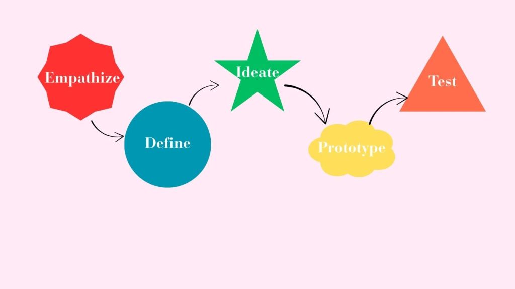
    When asked to compare two similar sites in both UX and UI design contexts, I chose to examine Target and Amazon’s mobile apps. These are two apps I frequent often, and through my own usage, I have noticed both pros and cons of the apps. Through a series of Feel and Need statements, I will examine the apps for what works well and what may need to be changed in areas of UX and UI design. First, we must discuss why UX/UI matters when it comes to the consumers using the products or goods we design. The UX design process centres on conducting user research in order to understand who your users are, what problems they face and what they require in terms of a viable solution.  This allows us to tailor the experience our consumers have with our product, which can lead to success and further expansion for the product. 

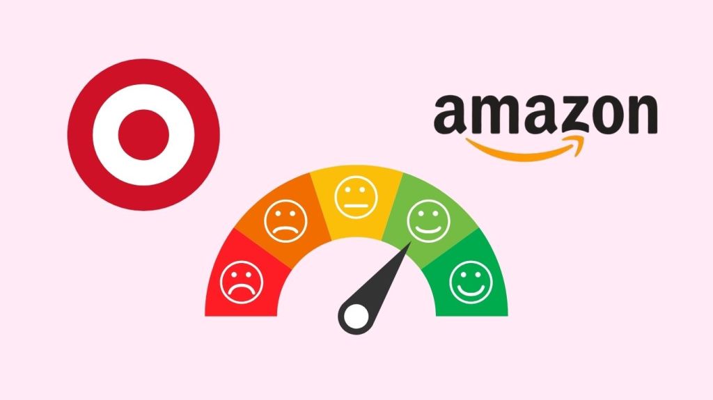
    When looking at Target’s mobile app through the lenses of UX design, these were my findings. Target’s navigation of its app makes me feel frustrated and troubled, as my needs for efficiency and competence are not being met, as the app has the search bar at the bottom of the homepage of the app, as opposed to the top of the page like most sites. This doesn’t allow me to navigate the site as easily as I would like . Target’s design of its app makes me feel confused and annoyed as my needs for and competence are not being met as the app has a confusing overall design at first glance, I would recommend that they move the search bar to the top and make the categories In a side bar rather than a scroll across bar as It can look limiting to the average consumer. Then I began to look at Target’s app through a UI lens. Target’s colors of its app make me feel content, as my need for trust is being met, as the app has the same familiar branding I’ve come to understand to connect to the brand over my time as a customer. This allows me to trust that my online experience will align similarly to my in-person experience. Target’s buttons on its app make me feel relieved and capable, as my needs for efficiency and competence are being met. The buttons are clearly listed correctly for their function, along with a clear Icon to further direct me towards the action or feature I am looking for.

    Then I began to compare Amazon through the aspects that would impact the UX/UI experience for the consumer. Amazon’s navigation on its app makes me feel calm and happy as my needs for efficiency and competence are being met. The navigation of this app, as compared to Target’s, is much easier. In my opinion, while they still have similar design features, the navigation itself feels easier. Amazon’s readability on its app makes me feel content and capable, as my needs for clarity and ease are being met. The app is very readable and has clear categories and headings, which adds to the overall app’s navigation. Amazon’s design on its app makes me feel calm and stimulated as my needs for clarity and information are being met. The app’s design is overall very Intuitive, and I feel it can be attributed to the search bar being at the top of the page and the clear titles for the tiles with their corresponding Images. The bottom bar also has Icons to provide context to each feature. Amazon’s colors on its app make me feel excited and confused, as my needs for recognition and clarity are not being fully met. While this app differs from the target and doesn’t use its brand’s color palette inside its app, the ever-changing aspect is something that can be exciting. My confusion is more so a question of wondering if they do this to make each experience more personal, since there is no In-person experience for shopping through Amazon.

    Overall, analyzing the UX/UI experience for apps can allow businesses to tailor their products to their consumer and be able to have successful products and build trust and positive experiences, and connections with their target audience.

    Sources: 
    Stevens, Emily. “The Value of UX Design.” UX Design Institute, 13 Nov. 2023, www.uxdesigninstitute.com/blog/the-value-of-ux-design/

    Check out more of my findings in the PDF below:

  • What is Design Thinking?

    What if I told you there was a way to design products or goods that would satisfy the needs and wants of both the consumer and the businesses responsible for bringing these products or goods to life? 

    Good News! There is, and it’s called Design Thinking. 

    Design Thinking is a design methodology that places the user, or human, at the center of the entire design process. Design thinking is different from other innovation and ideation processes in that it’s solution-based and user-centric rather than problem-based. This means it focuses on the solution to a problem instead of the problem itself.

    In a basic definition, Design Thinking is a five-stage process. It consists of empathizing with the potential user of the product and listening to their needs and wants. Then, defining what the problem at hand is and answering the How Might We question to solve the problem. Following these two steps, we begin the process of ideating or sketching out very basic ideas and concepts of solutions, and there could be anywhere from 5 sketches to 500 sketches… that’s up to you and your design team!

    Then the final two stages are Prototyping and Testing. Prototyping is when you bring ideas to life. This can be in 2D or 3D, depending on your product or service. Then comes the fun part, to really get an idea of your product’s potential success by testing the prototype against your target users. Once the testing is done, you can bring any notes or recommendations back to the drawing board to reiterate your product and further tailor it for success. 

    The benefits of utilizing Design Thinking

    So now that we know what design thinking is, why does it matter in the world of design? 

    Design thinking can be useful for both consumers and the businesses that utilize this methodology. 

    For businesses, design thinking is beneficial in a variety of ways.

    • Time Saving: Design thinking allows you to speed up the entire ideation process of designing a product or service. Whether you choose to break the process down over its typical and recommended time frame of five days or speed it up to fit five hours, you are sure to walk away with a fully thought-out and tested design after the five phases are completed. 
    • Saves money: This is a huge component of why I believe design thinking should be utilized more by companies. You save money, and when it comes to businesses, that’s very important in our ever-changing economic times. Through the five stages of this methodology, you aren’t constantly scraping ideas and starting over and wasting money; you actually are saving money and potentially making more as you have insights from your target audience. 
    • Shows consumers you care: Since the first step is literally empathizing with your consumers over what needs to be fixed or what is missing, and then building an entire design around their thoughts and feelings. By understanding the person affected by a problem, you can find a more impactful solution. 

    Sources: Han, Esther. “What Is Design Thinking & Why Is It Important? | HBS Online.” Harvard Business School Online, 18 Jan. 2022, online.hbs.edu/blog/post/what-is-design-thinking

  • Design Thinking: A Crash Course for QU

    I met up with my partner, Grace, to take on a design thinking crash course. We set up a two-hour time slot after our first class meeting to work through the design thinking process in real-time. I must admit, I have only completed a project like this once, actually, through my previous class, which was literally called “Design Sprints”. While my previous sprint was very successful in gaining proper insights from our user testers for adjustments, I still felt like a design thinking beginner with lots to learn. 

    That’s where my crash course with Grace came in… 

    As we began the call, just getting to know each other a people before design thinkers, we discovered Grace and I have very different experiences at QU so far. Grace is a QU undergrad and now a master’s student. While I have not even set foot on campus. Where grace had more insights about the school’s physical environment, I had more experience with the online-only experience. While this could have been a dividing factor for our interview and entire crash course, we actually used this to our advantage. We began ideating ways we could make the entire QU online graduate program better and more inclusive for those who have years of QU under their belt and people like me who haven’t even seen the campus in person…just really great photos! 

    We both acknowledge the importance of getting the most out of our time in this program, so we wanted a way to create an even more beneficial program for all students. So we each took five minutes to come up with “problems” we both have experienced with QU. We then listened and took notes on each other’s findings. We then took our findings and insights and turned them into HWM questions or How Might We… questions. Grace and I combined both of our finds and experiences into one question. That question being, “How might we find a way to blend the QU undergrad and non-QU undergrad students to create a universal experience?” 

    Grace and I then began to actually come up with sketches and ideas for solutions. We choose to utilize digital drawings and images to reflect the online experience more accurately. We both thought of a buddy system or mentorship program. We then had to figure out who would be the mentor and what they would provide and give to the mentees in the program. This led us to further think on the buddy system and decide the most effective combination would be if it were between QU undergrad students returning to the university and non-QU undergrad students who are also pursuing a master’s but don’t have the background of QU previously. We then started ideating on what the mentorship would consist of. We decided the most beneficial mentorship program would consist of calls and virtual tours/hangouts between buddies to help make the online experience feel the most physical, even with the barrier of technology between the students and campus. Then, through the final stages of the interview, we prototyped and tested the program against ourselves and discovered an area of adjustment, maybe to have the buddy system begin at orientation and carry on throughout the length of the program. 

    While this was just a crash course, we both felt that if this were actually tested in a full sprint or test, it would be very successful for all parties involved.

    Check out Grace and I’s interview below!