There is no doubt when it comes to visual design, logos can make or break a company. But as time has evolved, so have some of the most iconic companies and their logos. This allows brands to evolve with time and their customers while staying memorable through their visual design. Today, I chose to examine two of my most memorable logos for two iconic companies and compare how they have evolved through time.
The first company I chose to examine is YouTube. YouTube was first created in 2005. YouTube is one of the most iconic video-sharing platforms, with over 2.7 billion users reported monthly. But how has their logo changed over time?
2005:

This was YouTube’s first logo. The design is simple enough for users to comprehend the company name, but not yet the platform’s purpose.
2011:

The logo was updated to a darker red and given a matte finish. Again, the design is simple and comprehensible but lacks an overall sense of the platform’s purpose.
Which brings us up to current times…
2017:

This has been the YouTube logo since 2017. This logo still retains the simple aesthetics and colors of the two previous logos, but now includes the added play button. This allows the user not only to comprehend the platform’s purpose but also to give it a memorable motif.
Next, we will look at the evolution of Amazon’s logo.
Amazon started as an online bookstore in 1994 and has since become a mega store, partnering with vendors such as Whole Foods and Grubhub. But how has their logo evolved with the company over the years?
1995:
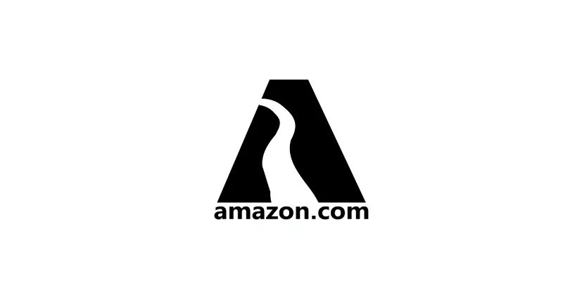
This is the original Amazon logo. It was inspired by the brand’s name. The logo was simple enough, but at the time, it didn’t truly reflect the brand’s purpose, which at the time was online book shopping, much like YouTube’s.
1998:
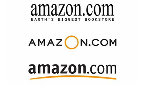
The company went through many logo changes in 1998, but ultimately stuck with this design until recent years. This logo is simple but lacks a reason to be memorable and a clear sense of the company’s purpose.
2000:

This is the current Amazon logo. This logo is an iteration of the 1998 logo, offering greater clarity and making the brand more memorable. The yellow smile line signifies the commitment to providing customers with a satisfactory online shopping experience. The smile line also starts at the A in the name and ends at the Z, indicating that any items are available from “A to Z”.